Please, PLEASE adjust the UI to prevent accidental touches. On far too many occasions I mis-tap and end up going to the community instead of the post. Or the User's profile instead of collapsing the comment. Drives me nuts! Those links are already in a separate menu; no need for the redundancy. Tapping anywhere on a post should only ever go to the post. Tapping anywhere on a comment should only ever collapse the comment.
Take a page out of Relay for Reddit, where you swipe to the left on a post or comment to bring up a submenu, and that's where your options to upvote/downvote, reply, view the community/user profile, etc. are. (i.e. Remove the 3 dots and put all those options in such a swipeable menu.) The current swipe gestures should be turned into a "slow swipe" gesture so that people still have the option to set their favorite shortcuts to them.
I think the program nvidia-settings has that? Try it out!
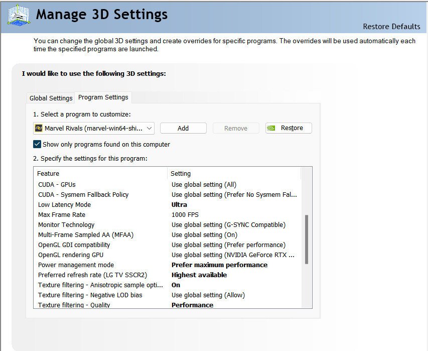
It does not. I'm talking about this page. Almost every game in existence is missing several settings that are on this page, especially GPU Power Management Mode, Negative LOD Bias, Max Framerate in the Background, and Max VR Prerendered Frames.
Really? I just installed it and all I see is news in French. When I try to add more "platforms", it tells me that I need to choose a platform first, but doesn't give me any options. It's like it just expects me to figure that out on my own. Very unintitive.
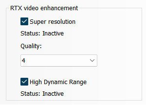
Does that driver support SDR to HDR conversation, AI upacaling, and most importantly: the 3D Settings page? I can live without the first two features, but I can't believe that there is no 3D Settings page in Linux. It has so many graphics settings that aren't available in most games.
And yes, AMD GPUs can't keep up. Especially if you like Ray Tracing. I'm not an AMD hater; I have a 7700X
No. All the major search engines removed most of their boolean features years ago. Without that it's a lot harder to find what you're looking for, especially when when you're trying to learn more about a niche subject (which is the majority of my searches). So sick of trying to search for something specific but can't because search functions like "intitle" and "+" and "OR" no longer work.
Novelty apps were practically the majority of what was out there in the early days of Android and iOS. I remember a lighter app, and an electric shaver app.
My favorite novelty app was that marble maze game on iOS that* used the accelerometer. I got really good at finishing those mazes in seconds, which upset my cousin because it was his phone and I demolished all his best times, lol. Only video game I was ever good at.
On a similar note, skins and other cosmetics in video games that do nothing to help with camouflage—or worse—make you stand out more. Never understood why people waste money on that.
Lucky. I couldn't get HDR working properly, and most of my GPU features were missing because Nvidia refuses to support Linux (and AMD GPUs can't keep up). So I had to go back to Windows.
Been trying to switch to Linux since 2004. I'll try again in 5 years.
Yeah but the Source engine is actually good. It was so far ahead of its time that I still think Half-Life 2 can hold up to modern standards. Gamebryo/Creation was never good.
And to be fair, every drivable vehicle mod I've tried in Fallout games was janky.
But to be even more fair, you can't blame the modders. It's Bethesda's fault for using an engine from 1997, and simply slapping a fresh coat of paint on it for every new release.
Actually, the pixels go completely black and do not consume any electricity at all in that state.
You might be thinking of early OLEDs, which had to stay on at all times to prevent blur/smearing. But panel manufacturers solved that problem a few years ago. Don't remember exactly when the change happened, but I remember first seeing true black OLEDs sometime around 2017/2018.
Please, PLEASE adjust the UI to prevent accidental touches. On far too many occasions I mis-tap and end up going to the community instead of the post. Or the User's profile instead of collapsing the comment. Drives me nuts! Those links are already in a separate menu; no need for the redundancy. Tapping anywhere on a post should only ever go to the post. Tapping anywhere on a comment should only ever collapse the comment.
Take a page out of Relay for Reddit, where you swipe to the left on a post or comment to bring up a submenu, and that's where your options to upvote/downvote, reply, view the community/user profile, etc. are. (i.e. Remove the 3 dots and put all those options in such a swipeable menu.) The current swipe gestures should be turned into a "slow swipe" gesture so that people still have the option to set their favorite shortcuts to them.
Please, I'm begging you to implement this.