A map showing which countries people are moving into and which countries people are moving out of.
A map showing which countries people are moving into and which countries people are moving out of.
brilliantmaps.com
Does Your Country Have More Immigrants Or Emigrants? - Brilliant Maps
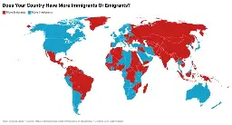
There is one thing the article omits which is very important: the time frame. At first it looks like this is based on 2024 numbers alone but seeing 52 million for the USA (about 15% of total population) and 16 million for Germany (20%) made me check the linked source. The data was aggregated over the last 35 years.
It also is using absolute numbers rather than any kind of normalized scale. If a country of 5 billion people has a million leave that's not exactly the same thing as a country with a population of 10 million having a million leave. A lot of these sorts of things suffer from this problem where the maps end up matching very closely to maps of population density.
The coloring is solely based on which number is higher for each country, that doesn't change if you use relative numbers.