

GNOME June 2024: C'mon you can do better
The issue there isn't only differentiation, that well done, the issue is that an user might miss click because both buttons are close to each other.
Well, I understand your POV... but real software freedom instead of messages asking you to buy a license and a questionable kernel is always a good choice :P
I'm glad to know that I could help.
I like that I can switch out my distros underneath Incus instead of being stuck on one weird kernel
This is an interesting take that I never considered before, my experience (be it corporate or at home) is usually around Debian machines running Incus and I never had the need to replace the distro underneath it.
In-depth analysis ≠ random ramblings on lemmy.
Open Source 'Eclipse Theia IDE' Exits Beta to Challenge Visual Studio Code -- Visual Studio Magazine
Jump
Great sum up, yes, the major issue with VS Code is the licensing issues that Microsoft caused there.
You need to understand what Proxmox gives you, which primarily is ability to run/manage/backup/etc VMs easily
Yeah and after understanding what it gives you then you move to Incus because while it might be a bit harder to setup it delivers around 80% of what Proxmox does without the overhead, mangled kernel and licensing issues.
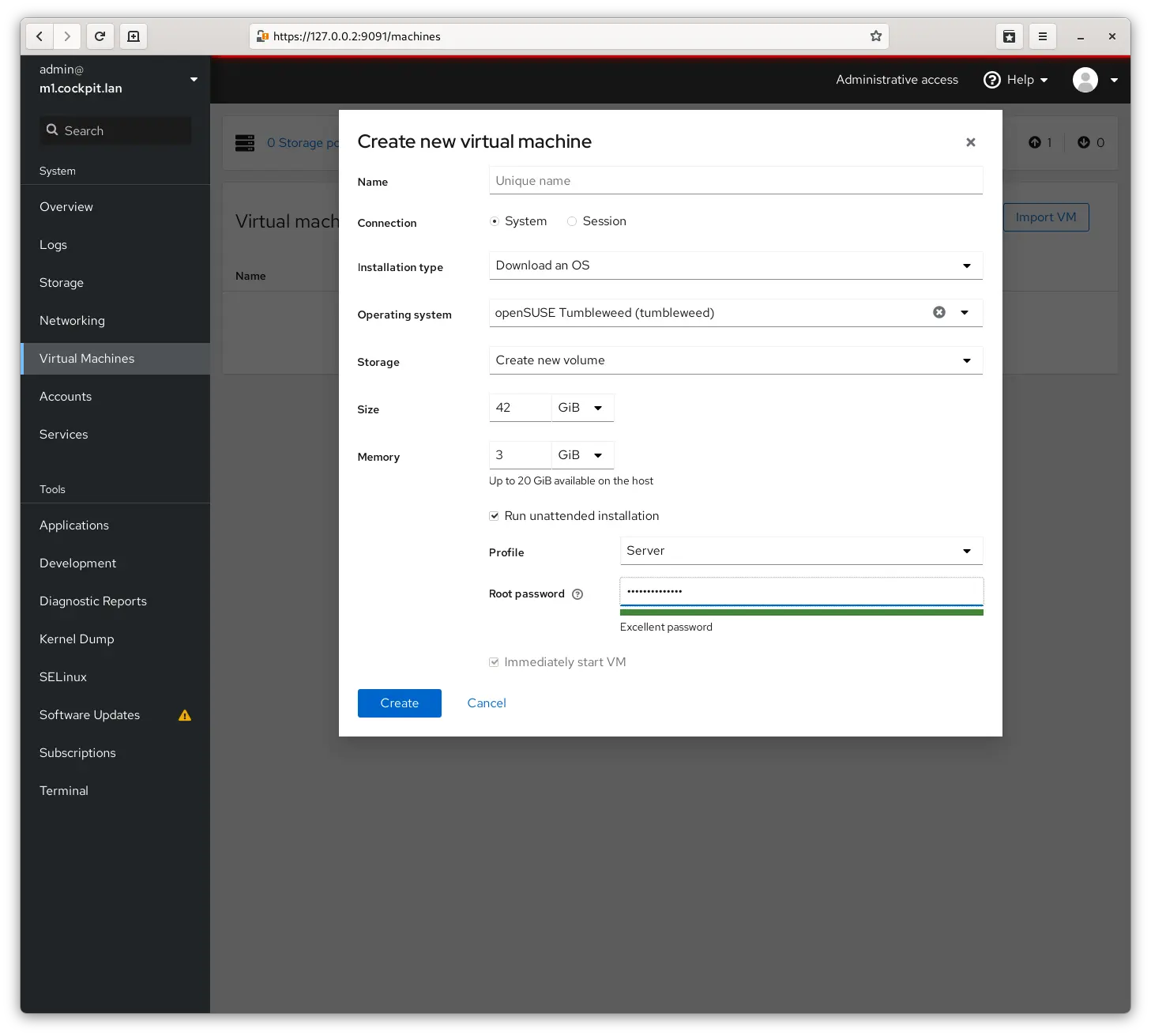
https://cockpit-project.org/ also does VMs and can work for people without cluster needs.
How to reliably(!) exclude files from a list in tar?
You delete the entire file because the format and tools are hard to deal with for basic operations like this one. :)
Just kidding... but we know there's some truth to it.
The older one is actually properly executed, the first button is the "Cancel" one and that makes sense because people read from left to right and tend to click mindlessly / without reading on the first button. Not sure if they actually changed the position on right to left languages but they should have...
How? Improving something like this is hard. Do you have any proposals?
I've submitted a fair share of UX in-depth analysis with examples and links to literature on the GNOME team blog and they tend to ignore / comment dismissingly and then remove my comments after a few weeks.
Accent color taboo. Let’s not talk about accent color.
Ahahaha
C'mon just move to Incus: https://lemmy.world/comment/10896868 :P
If you know your way around Linux you most likely don’t need Proxmox and its pseudo-open-source... you can try Incus / LXD instead.
Avoid Proxmox and safe yourself a LOT of headaches down the line. Go with Debian 12 + Incus/LXC, it runs VMs and containers very well. Proxmox ships with an old kernel that is so mangled and twisted that they shouldn’t even be calling it a Linux kernel. Also their management daemons and other internal shenanigans will delay your boot and crash your systems under certain circumstances.
LXD/Incus provides a management and automation layer that really makes things work smoothly - essentially what Proxmox does but properly done. With Incus you can create clusters, download, manage and create OS images, run backups and restores, bootstrap things with cloud-init, move containers and VMs between servers (even live sometimes).
Another big advantage is the fact that it provides a unified experience to deal with both containers and VMs, no need to learn two different tools / APIs as the same commands and options will be used to manage both. Even profiles defining storage, network resources and other policies can be shared and applied across both containers and VMs.
I draw your attention to containers (not docker), LXC containers because for most people full virtualization isn't even required. In a small homelab if you can have containers that behave like full operating systems (minus the kernel) including persistence, VMs might not be required. Either way LXD/Incus will allow for both and you can easily mix and match and use what you require for each use case. Hell, you can even run Docker inside an LXC container.
For eg. I virtualize the official HomeAssistant image with Incus because we all know how hard is to get that thing running, however my NAS / Samba shares are just a LXD Debian 12 container with Samba4, Nginx and FileBrowser. Same goes for torrent client that has its own container. Some other service I've exposed to the internet also runs a full VM for isolation.
Like Proxmox, LXD/Incus isn’t about replacing existing virtualization techniques such as QEMU, KVM and libvirt, it is about augmenting them so they become easier to manage at scale and overall more efficient. I can guarantee you that most people running Proxmox today it today will eventually move to Incus and never look back. It woks way better, true open-source, no bugs, no delayed security updates, no BS licenses and way less overhead.
Also, let's consider something, why use Proxmox when half of it’s technology (the container part) was made by the same people who made LXD/Incus? I mean Incus is free, well funded and can be installed on a clean Debian system with way less overhead and also delivers both containers and VMs.
Yes, there's an optional WebUI for it as well!
- Context on Incus vs LXD: https://www.theregister.com/2023/08/04/incus_lxd_fork/
- A sum of my experience with Proxmox over the years: https://lemmy.world/comment/7476411
Some documentation for you:
just take it and make it better here and there. Just a few steps left :)
You mean, copy it and make it open :P I guess something along the lines of https://github.com/CuarzoSoftware/Louvre
@ehopperdietzel is working on that it seems.
it just looks like Mac because top bar, dock and some design choices
Top bar, dock, system settings, activities (somewhat e mix between Apple's mission control and launchpad), now the modal buttons, accent colors... and so many other things.
MacOS felt extremely clunky to use vs gnome’s fluid workspace and app switching.
Maybe you were running it without proper GPU acceleration and without a keyboard with actual macOS shortcuts on the function keys? Virtualizing macOS is hard and it will give you a very poor experience.
Obviously macOS has it's defects but at least you aren't risking losing your work due to a misclick nor you are restricted from having desktop icons like you're on GNOME :)
I get it that you hate this design
I don't hate it, it looks better than what was there before, no doubts there, but at the same time they could've just made it better.
All the literature on action buttons with dangerous effects tells you to add margins, accents and shades. Any design undergraduate should be aware of this, however the GNOME team totally missed it.
It’s going to be a good update with accent color support (I won’t fight about it ok?)
It's funny that you mention that because...
In macOS, you can specify an accent color to customize the appearance of your app’s buttons, selection highlighting, and sidebar glyphs. The system applies your accent color when the current value in General > Accent color preferences is multicolor. https://support.apple.com/en-mt/guide/mac-help/mh15217/mac
I'm totally okay with "being inspired" (cloning) macOS, it should be viewed as good thing because Apple does spend a lot in UX research however lets make thing properly.
That's my point. :)
However for this they would need to admit to themselves that they're essentially a copy of macOS.
I don't completely disagree with you, however the cost of losing an important document because you clicked on the wrong thing is way higher than having to look at the extra space every day.
Please do not reduce the community effort to “cloning macOS”. It’s insulting to the people working on it…
Well, it's insulting for people to lose their work because someone did a lousy UX job. :)
Cloning macOS should not be views as something "bad" because for what's worth we all know Apple spends a LOT in usability research (they're not as good as they used to be, but still better than the rest).
Kudos for noticing this extra space which could enhance these kind of modals though.
That's the thing, I've basic design / UX training and all the literature on action buttons with dangerous effects tells you to add a margin. Any design undergraduate should also be able to notice that life saver as well... however the GNOME team totally missed it.
This isn't the first time them failing at basic UX and they don't like when people try to suggest improvements nor when they later on criticize them.
Both designs are good imo. Adding the extra space for the “cancel” button could cause a copyright claim
What ahaha since when a modal is copyrighted? I don't buy it, this is simply poor design by the GNOME team.
GNOME’s workflow is similar to Apple’s so why not copy some more things for better consistency?
Exactly my point, but they should learn how to properly copy things. Or at least think about them, Apple didn't add the margin for no reason.
Ahaha fair enough. * screams in KDE *
I'm kind of on the same boat you're... however KDE tends to have issues with visual proportions and margins everywhere.