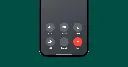
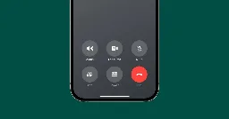
Yes, iOS 17 is changing where the ‘end call’ button is located
Yes, iOS 17 is changing where the ‘end call’ button is located
9to5mac.com
Yes, iOS 17 is changing where the 'end call' button is located - 9to5Mac
Yes, iOS 17 is changing where the ‘end call’ button is located
Yes, iOS 17 is changing where the 'end call' button is located - 9to5Mac
I’m so angry right now. I was waiting to buy an iphone with USBC, but they have crossed the line. My next phone will not be an Apple.
Lol
That’s clear impression I am getting from all those alarmist articles about “the feature that will anger the users”. Total clickbatary.
I don't understand why the button couldn't have remained in the middle of the screen. It makes sense in the middle, being such an important button. It's easy to reach no matter which hand you use to hold your phone. It's the norm and people are used to it.
The only justification for its having it on the right side I can think of is that the button ends up exactly where you drag to answer a call, so the answer button turns to an end call button.
Which leads me to my real gripe with the slide to answer and button positions. If you swipe as a reflex but it’s button displayed you actually end the call by mistake.
Only explanation I can think of is that phones before touch screens used to have the end call on the right.
Or, you know, you slammed the the bit you held into the body of the phone with a satisfying “pling”.
Now get off my lawn.
Apple Fanboy = Ha! Ha! Look at the silly old people who can't keep up with new technology! Adapt or die!
Apple Fanboy after 'end call' is moved....
Why? You’re just going to ruin anyone with mussel memory.
And what about those with clammy hands?
is it shellfish of me not to care about them?
It's already saved me from accidentally tapping a recent or favorite number because they hang up a split second faster than my thumb lands on the end button. I approve of this change.
About damn time
Muscle memory is a thing. Good designers used to know that.
Ugh. That’s gonna be bad for my muscle memory.
They did this to the Duo MFA app push notifications on Android (switched 'Accept' and 'Decline') a couple years ago, it was a rough month for work.
I believe there’ll be an option for you to change the layout
Apple isn’t amazing at giving option, but they’re getting better.
I say this as an iOS user of like… 10 years? Love it, but it took a little too long for a dark mode to exist.
Don’t see one in the public beta
There is not
The option will be to pay $50 extra for a “leftie” model that moves the button to the other side.
Yeeeeh I take or make maybe two calls per month, so I personally won’t be affected.
I do think the bottom right corner is a good place for it, though—it’s unmistakable where to find it.
where do you take them to?
Oh come on. Who actually uses their phone to make calls? Muscle memory. As if.
/s
You’re being downvoted for your Reddit sarcasm tag
“I AM JOKING SEE I AM JOKING YOU SHOUDL KNO”
It took like 3 calls for me to get used to it. Now I wonder why it wasn’t in the bottom right corner the whole time. It’s so much better
I'm guessing because left handed people exist?
It also moved speaker and mute. I’ve been muting a lot of people since the beta went live.
I use the beta, I still hate it.
Apple is especially bad at this. They constantly make tweaks that are completely unneeded.